Usability testing
Before launch, I created a prototype and conducted moderated remote usability tests with 6 partners — 2 each from the Philippines, Indonesia, and Malaysia — to evaluate whether the proposed partner portal could address shared operational gaps across different markets. I focused on understanding if any key information need was missing, how partners would use available information in context, and whether these early concepts addressed the pain points uncovered during discovery.
Key insight that refined our product understanding
The most pivotal finding from usability testing was a misalignment in assumptions around what partners truly needed:
- What we assumed: Partners needed seller-level information to resolve pickup issues and follow up directly with sellers.
- What we learned through testing: What partners really want is to understand why a pickup failed, not just that it failed. Since missed pickups affect their KPIs and how well they manage their teams, they need tools to trace what happened and take action — not just contact the seller. That’s why they care more about parcel-level details than seller info.
- Why we missed this: We focused heavily on driver coordination in the Philippines which led us to the assumption. However, usability testing revealed a key gap where in markets like Indonesia and Malaysia, partners are more concerned about parcel-level outcomes.
Since the MVP is first launching in the Philippines, we prioritised route and driver tracking and waypoint reassignment features to support day-to-day pickup coordination. The insight around parcel-level auditing will guide future iterations as we expand to Indonesia and Malaysia, where operational needs differ.

Usability test session with one of our Philippines partner

Usability testing themes and insights synthesised in Dovetail
While core workflows were intuitive, testing uncovered areas that needed design refinements to reduce friction and improve efficiency:
Key insights that helped refine our designs
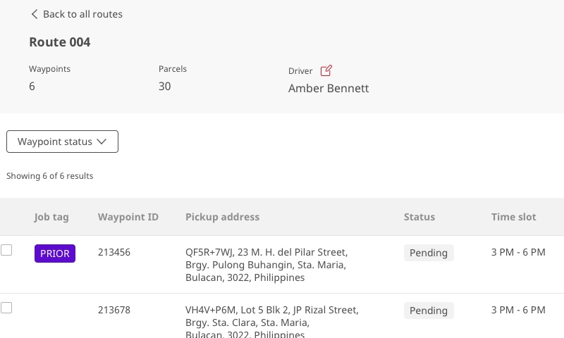
Lack of discoverability of filters
Users initially missed the filter option as it was tucked within a dropdown. By surfacing filters directly in the header row, we made them more immediately accessible, reducing friction and helping users find relevant pickup details faster.

Before

After
Unclear affordance of icon-only buttons
Icons without labels created friction in understanding actions, especially for logistics operators who tend to be cautious about clicking unfamiliar icons for fear of disrupting ongoing operations.