
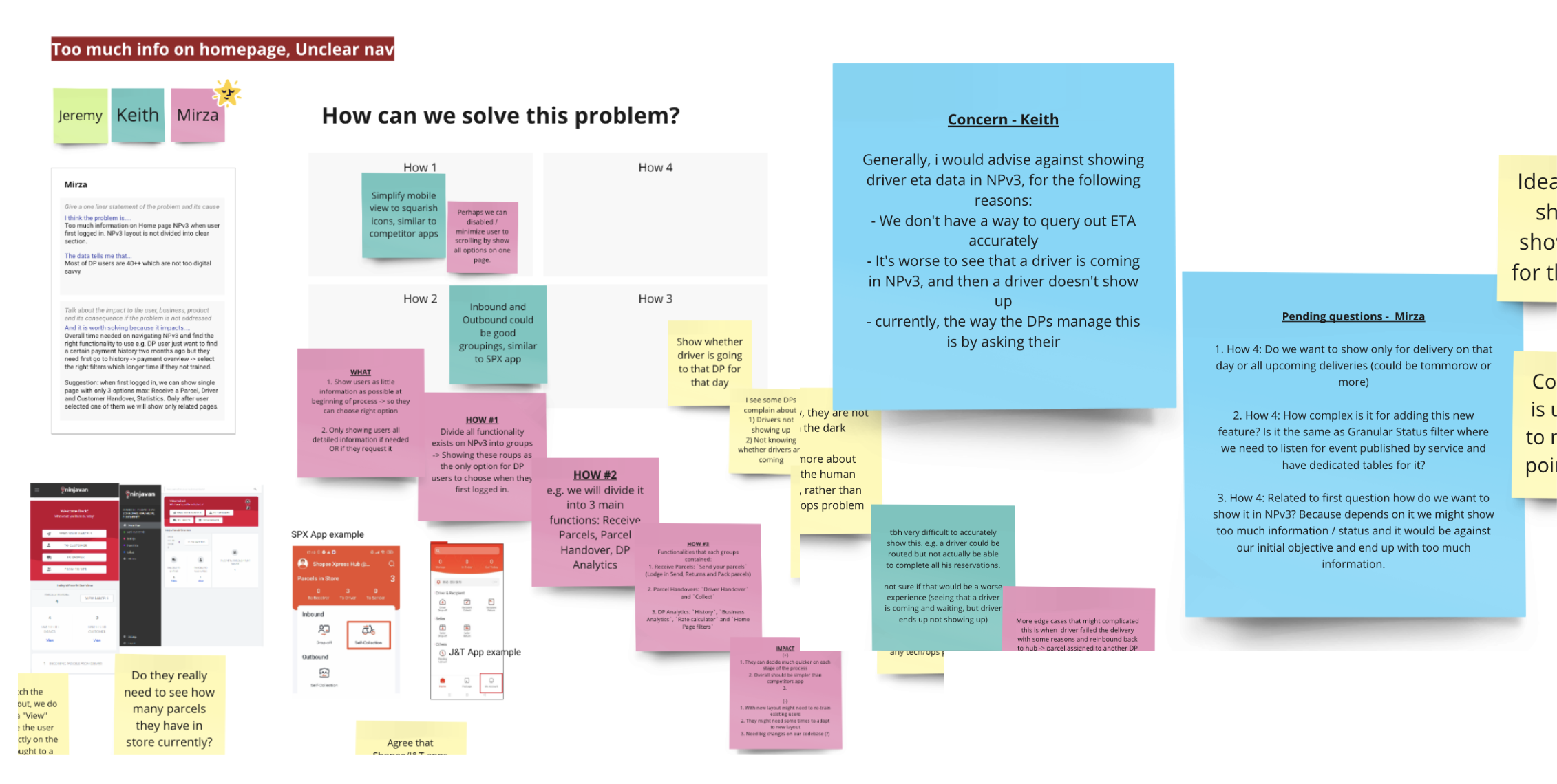
We ran a structured 3-day cross-functional brainstorming session to narrow down the identified high-level problems, cluster them into themes, and explore solution directions.
Bringing together the teams helped to align on priorities and co-create actionable ideas. This ensures that the revamp is not only user-centric but also technically feasible, operationally grounded, and commercially viable
Example of solution exploration

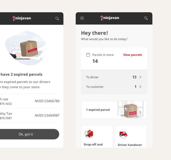
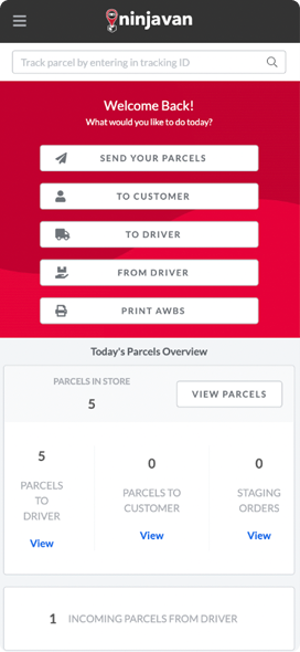
Before
After
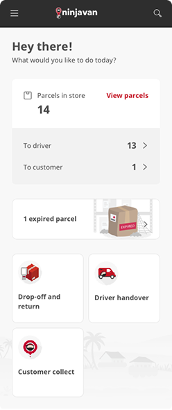
Cleaner visual hierarchy: Simplified layout and labels reduce cognitive load and improve focus on key information.
Better parcel overview: Important parcel data is prioritised and redundant info removed for clarity.
Highlight expired parcels: Expired items are now clearly flagged to prevent missed handovers.
Clearer navigation: Icons and concise action labels (e.g. "Drop-off and return") improve usability and discoverability.
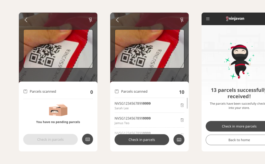
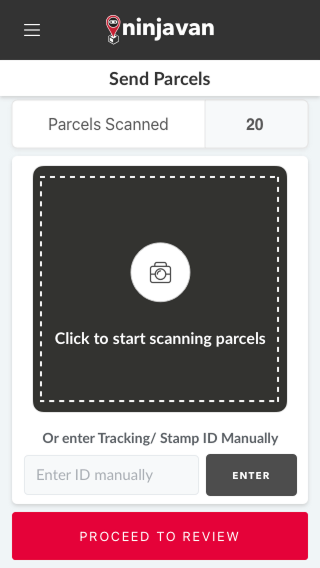
Before
After
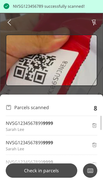
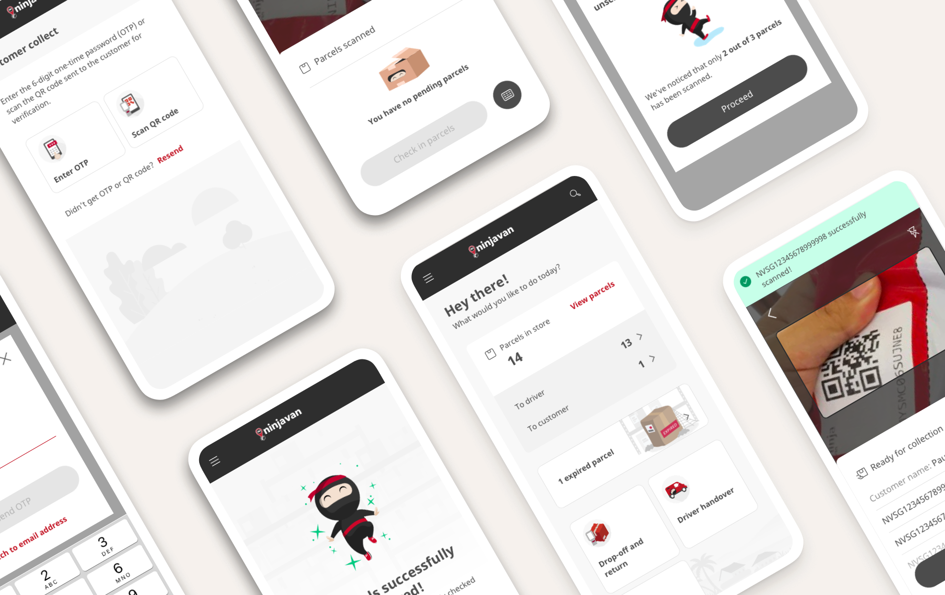
Unified scan and review screen: Partners can now view parcel details and scan results in real time, enabling faster feedback and on-the-spot troubleshooting.
Only essential info displayed: Shows key details like customer name and tracking ID to help partners quickly match with the physical parcel.
Clearer error feedback: Each scanning error type is now specified individually, reducing confusion and helping partners take the right corrective action.